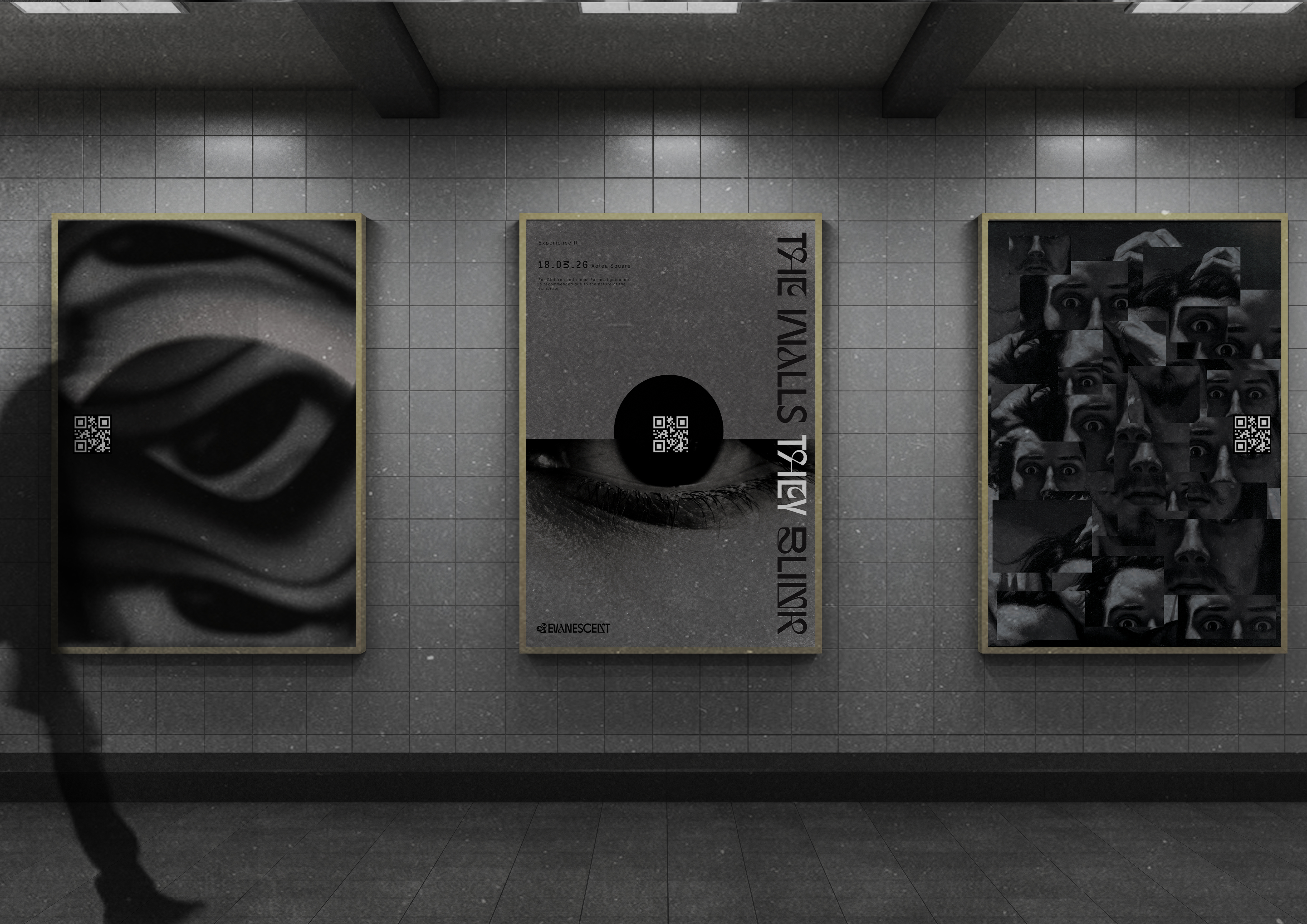
2026
Evanescent
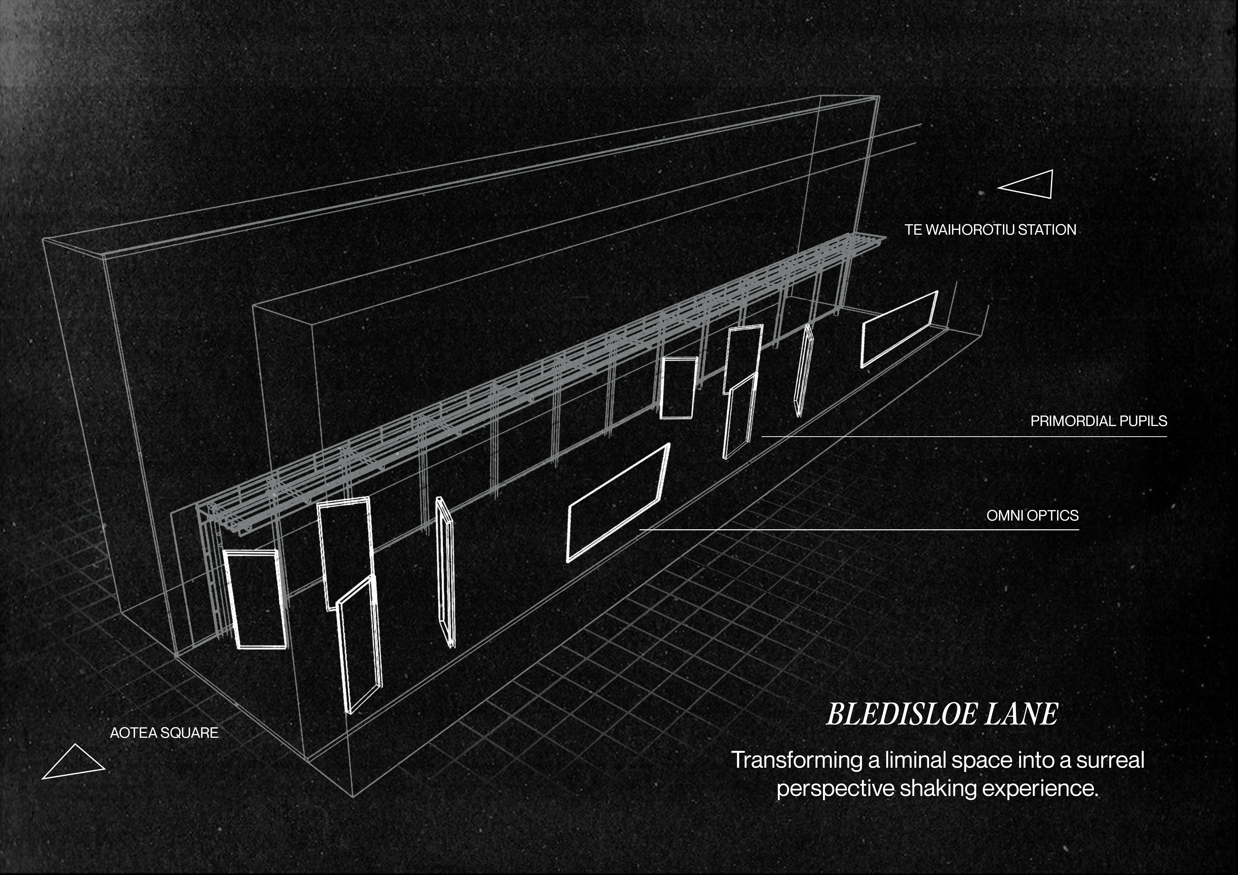
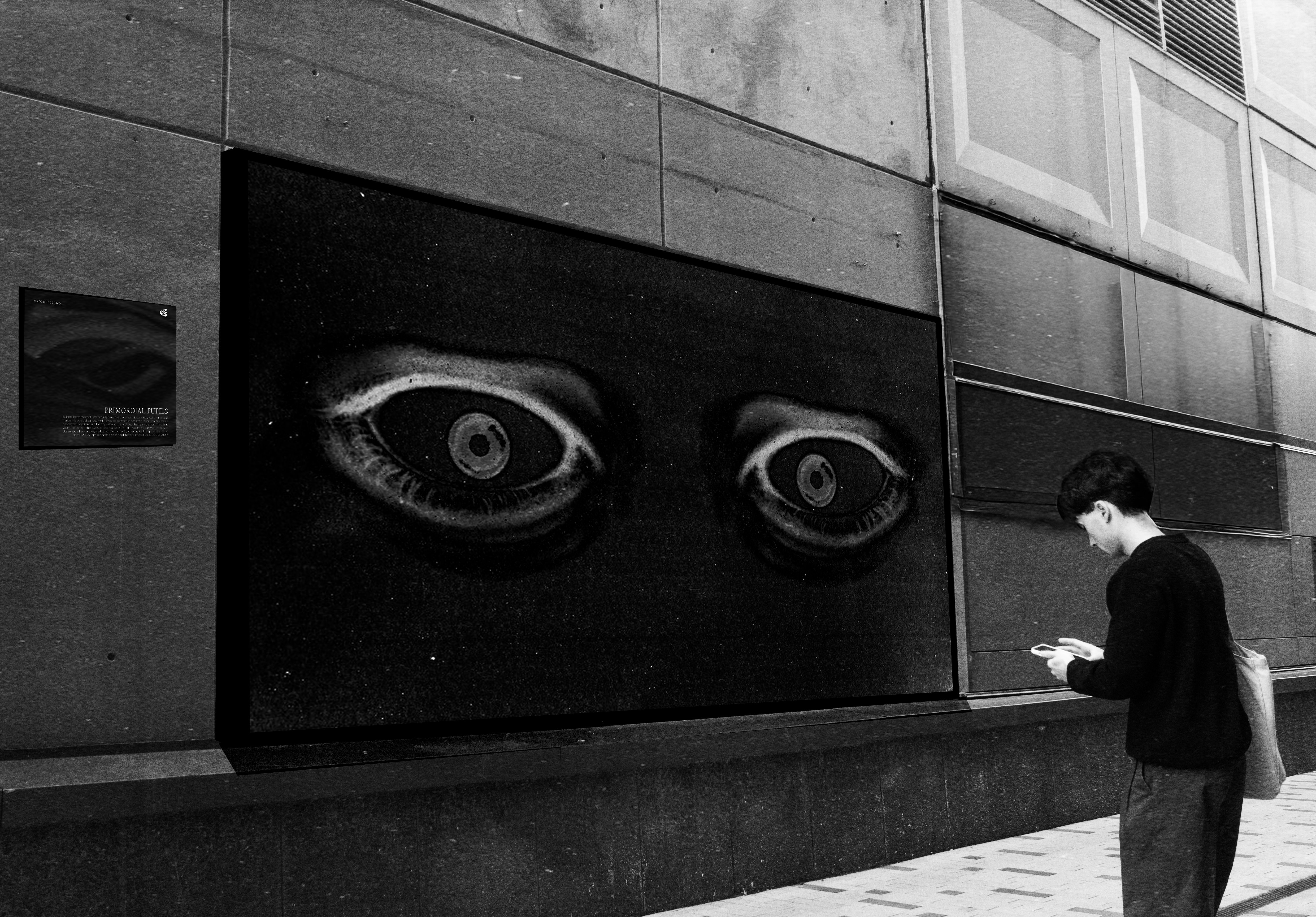
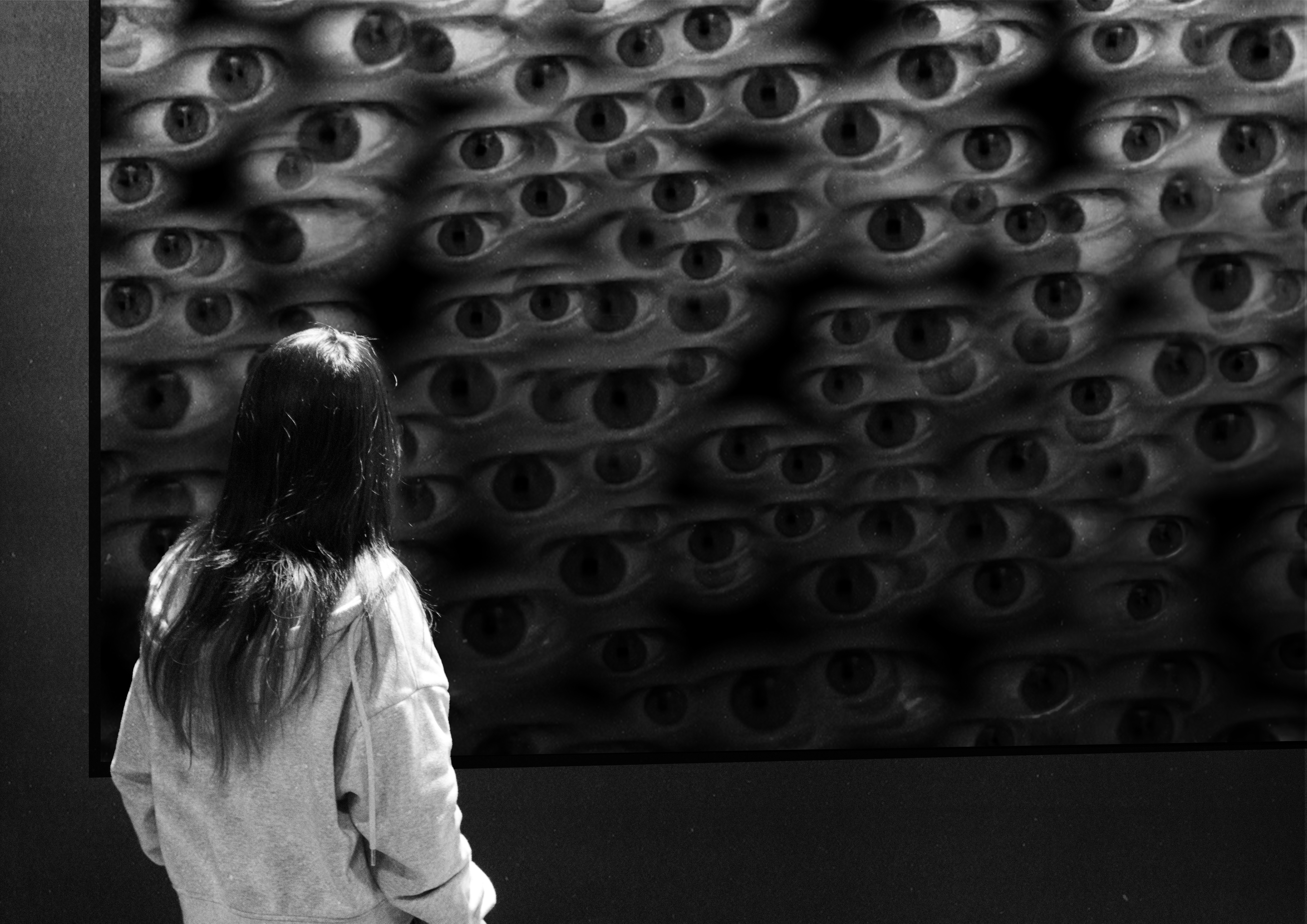
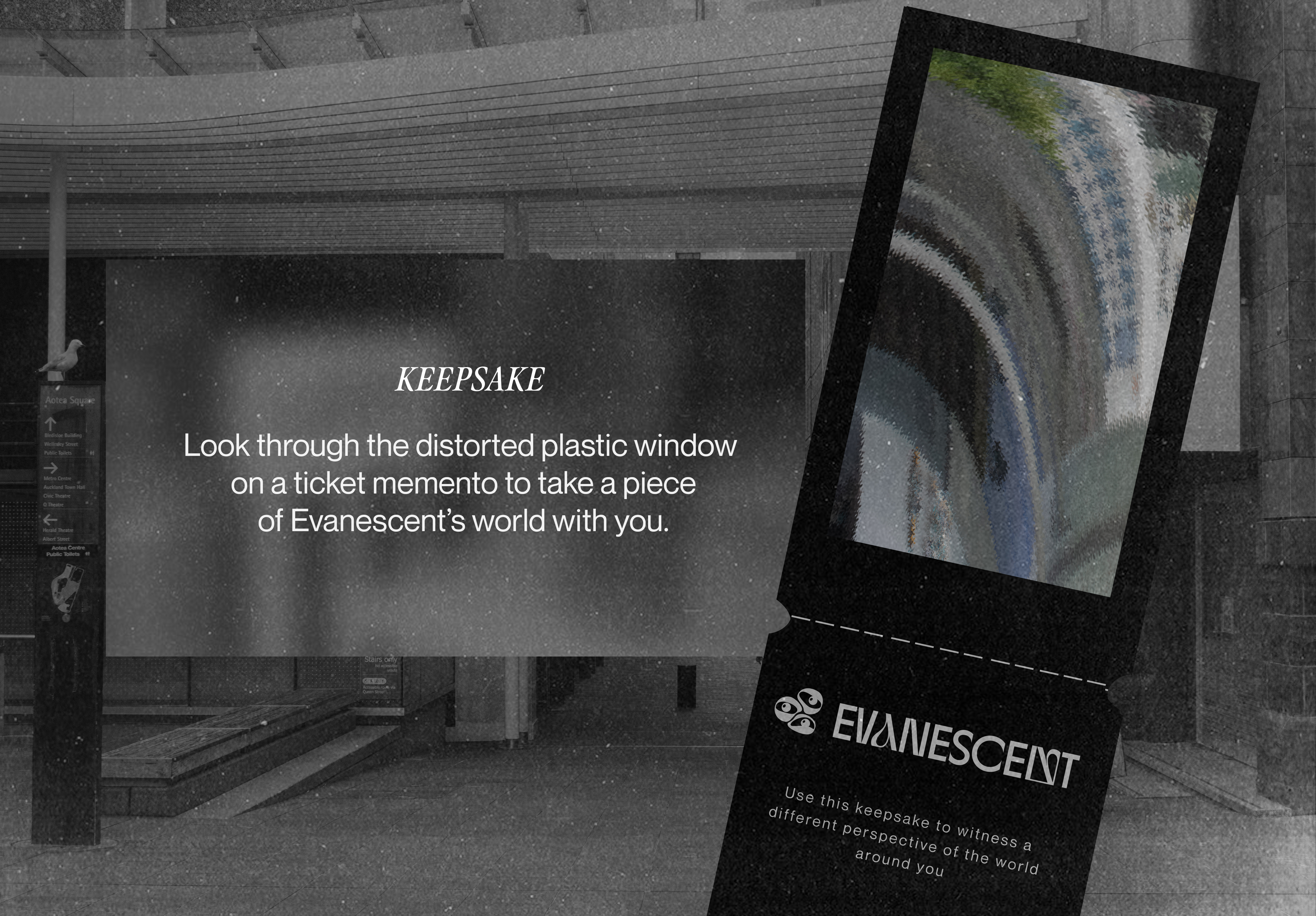
Evanescent responds to the growing absence of non-engaging, intrinsic playful experiences in adult life. Urban environments are often designed for navigation and productivity, leaving little room for imagination or spontaneous engagement. Evanescent is an interactive digital experience that invites audiences to re-experience their commuting routine. By using two interactive installations that destabilise perception, and invites users to engage through curiosity. With no incentives of reward or predetermined outcomes.
The brief:
“Identify a gap or a problem in our society, then design and develop a means to incorporate an intrinsic sense of ‘playfulness’.”
Our Problem statement:
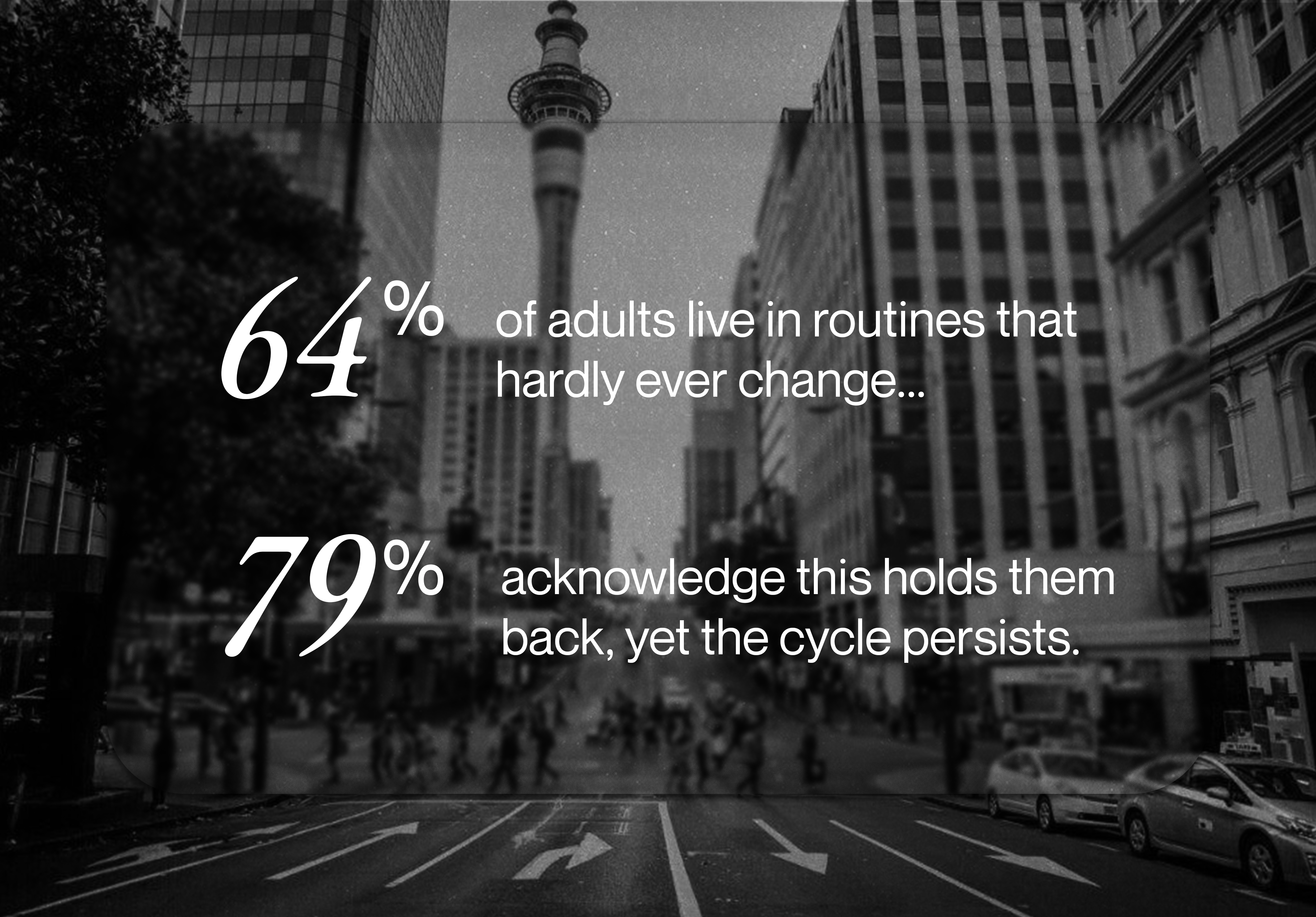
“Urban commuters in Auckland are trapped in repetitive, mundane routines that numb curiosity and attention, leaving little room for spontaneity.”
Research question:
“How can we disrupt urban commuters and entice curiosity while changing perspective.”
Through research, we found that commute anxiety is a significant source of stress for commuting adults in New Zealand, oftentimes taking up a significant portion of their days.
Due to the significant nature of the commute, commuters in Auckland often tend to rush which can result in negative effects on a person's physical and mental well-being.
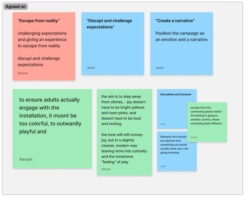
Ideation
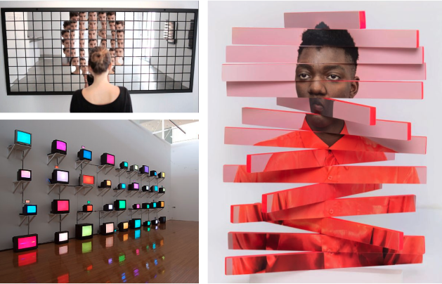
We wanted our audience to feel something different. Something they usually don't feel. To allow them to feel a sense of an escape from reality. In order to capture and evoke a certain emotion, a narrative and emotional position was crucial. Through the visuals we had collected, I realised that the art movement Surrealism was a good direction to go in due to the playful nature of the visuals and potential concepts for installations.
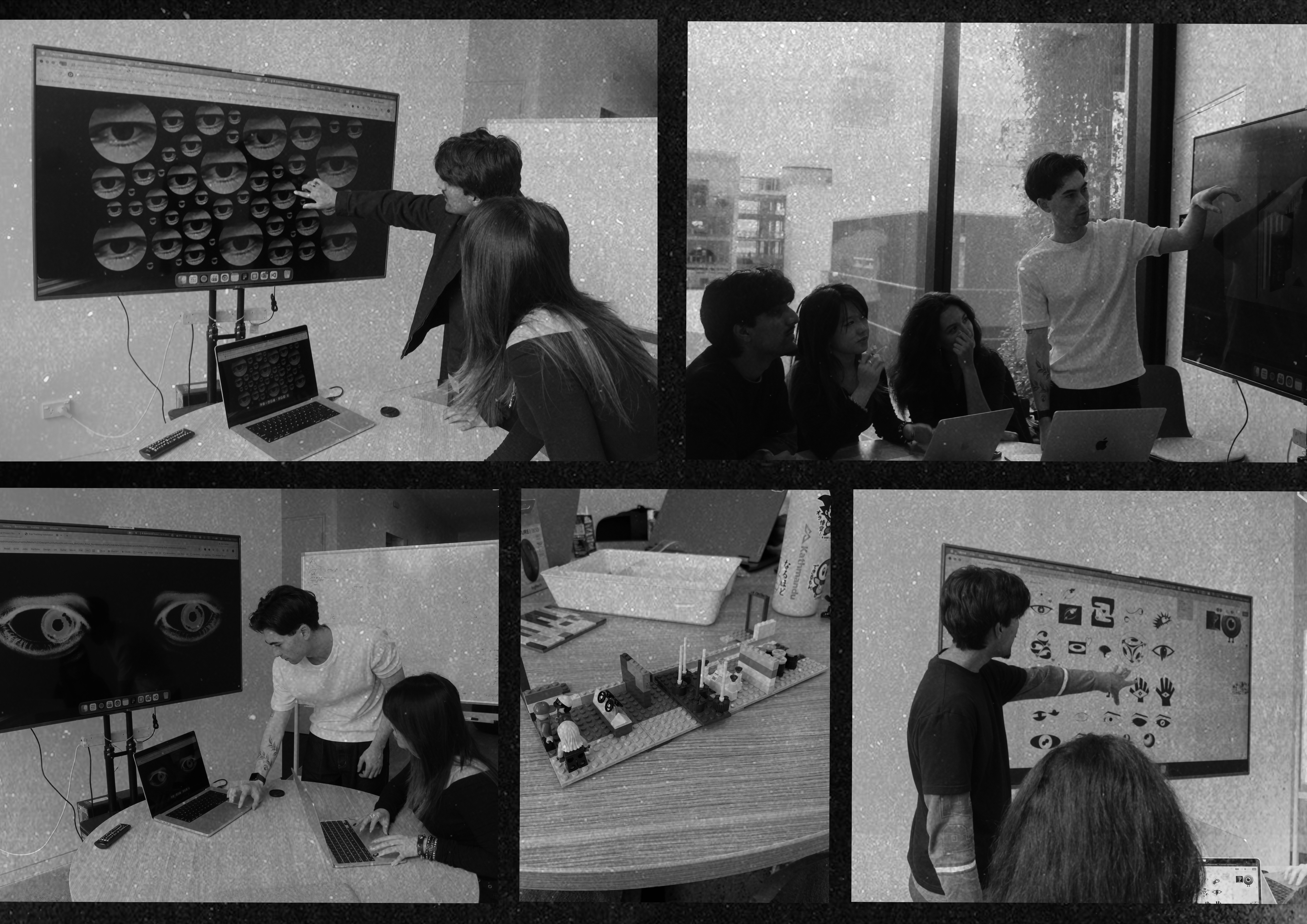
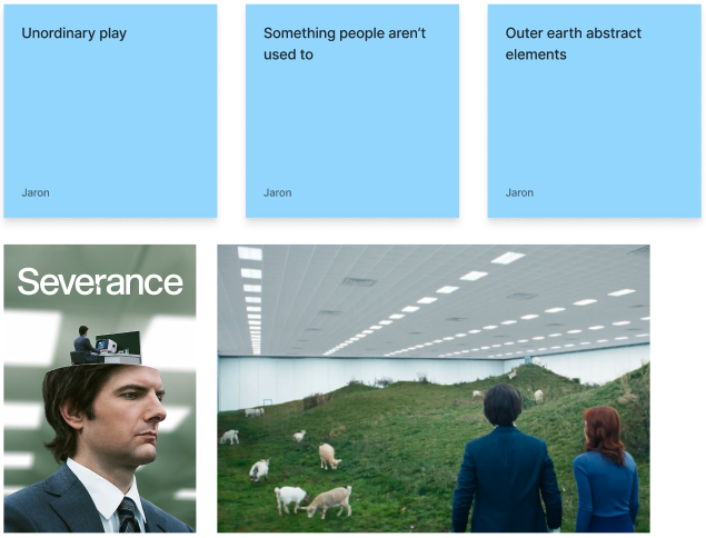
During this ideation process my team and I looked at various images and television shows as inspiration for the project.
The show Severance played a heavy role in the ideation phase due to the unsettling emotion and spatial layout of the space featured on the show.
We looked into how we can replicate the unsettling, mysterious feel of the show and force a new perspective onto the audience.
Experiments
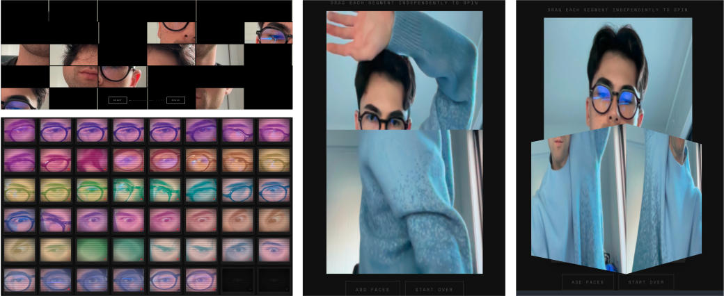
I experimented and refined multiple visual directions. Varying in shapes, colours and spacing.
Interactive prototypes
Eye being the focus
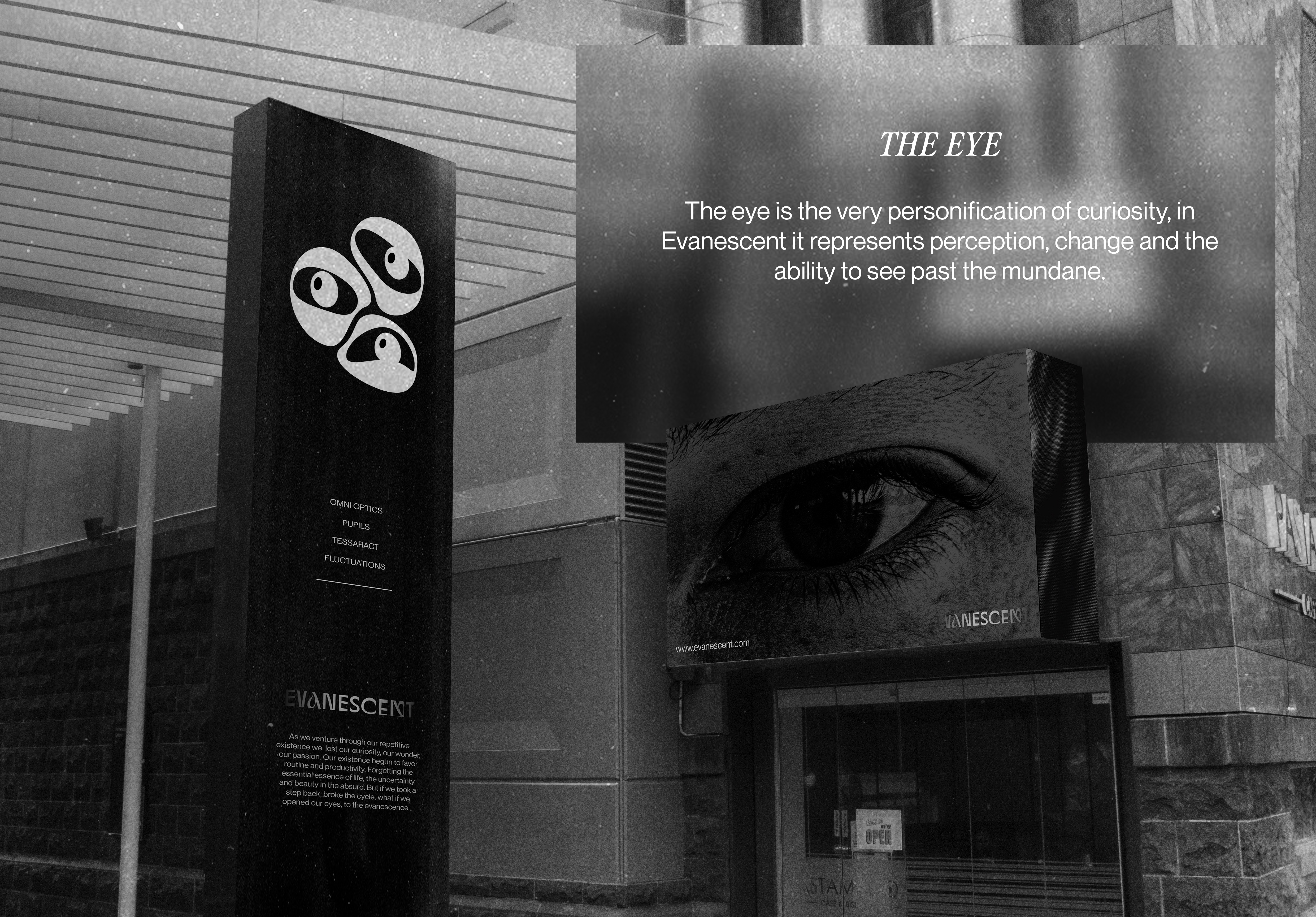
As part of the experience, I found that the eye was a great focus point for the installations.
The concept of using the body as the medium to convey the narrative was what I found could stand out and produce surrealist installations and experiences.
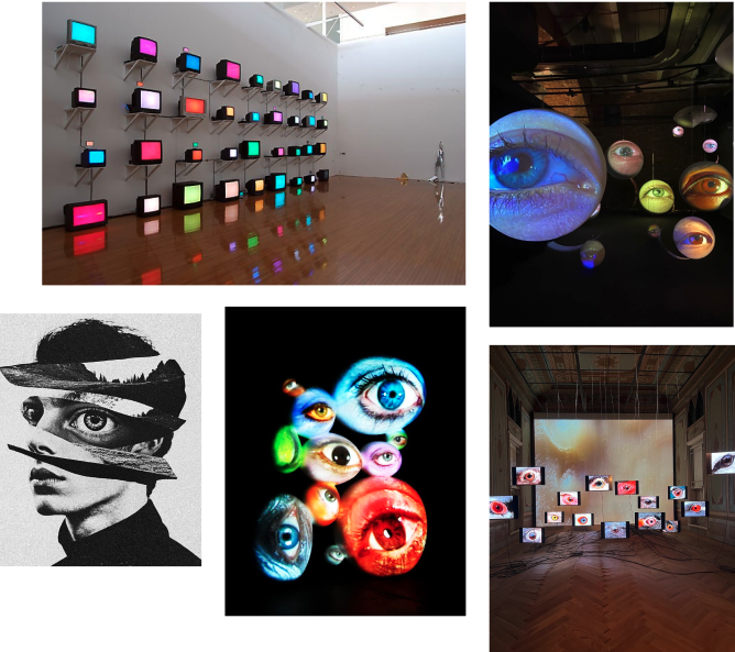
The human eye can be unsettling and due to our concept being about perspective and surrealism I decided to push further on this and start prototyping and refining an interactive installation.
First version, experiment in a frame retro TV.

Iterations
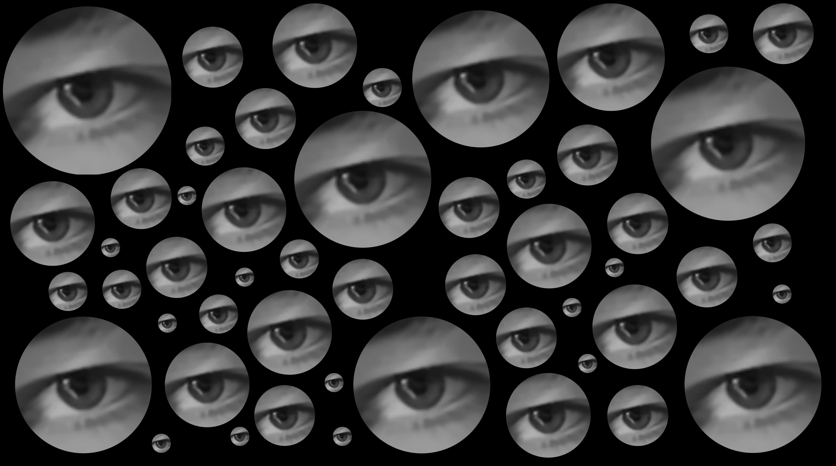
This version featured approx 50 circles in various sizes with a greyscale filter over eyes.
Each time a visitor blinks, 3 eyes appear in random circles, confusing the visitors and further drawing them into the surreal experience.
We decided on greyscale and black and white for the visual direction of the whole exhibition.
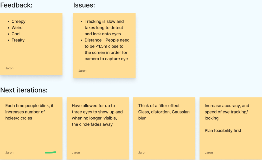
I conducted user testing to test the functionality and raw reactions to the installations.
A couple of points were noted for the interaction of the installation.
Final version
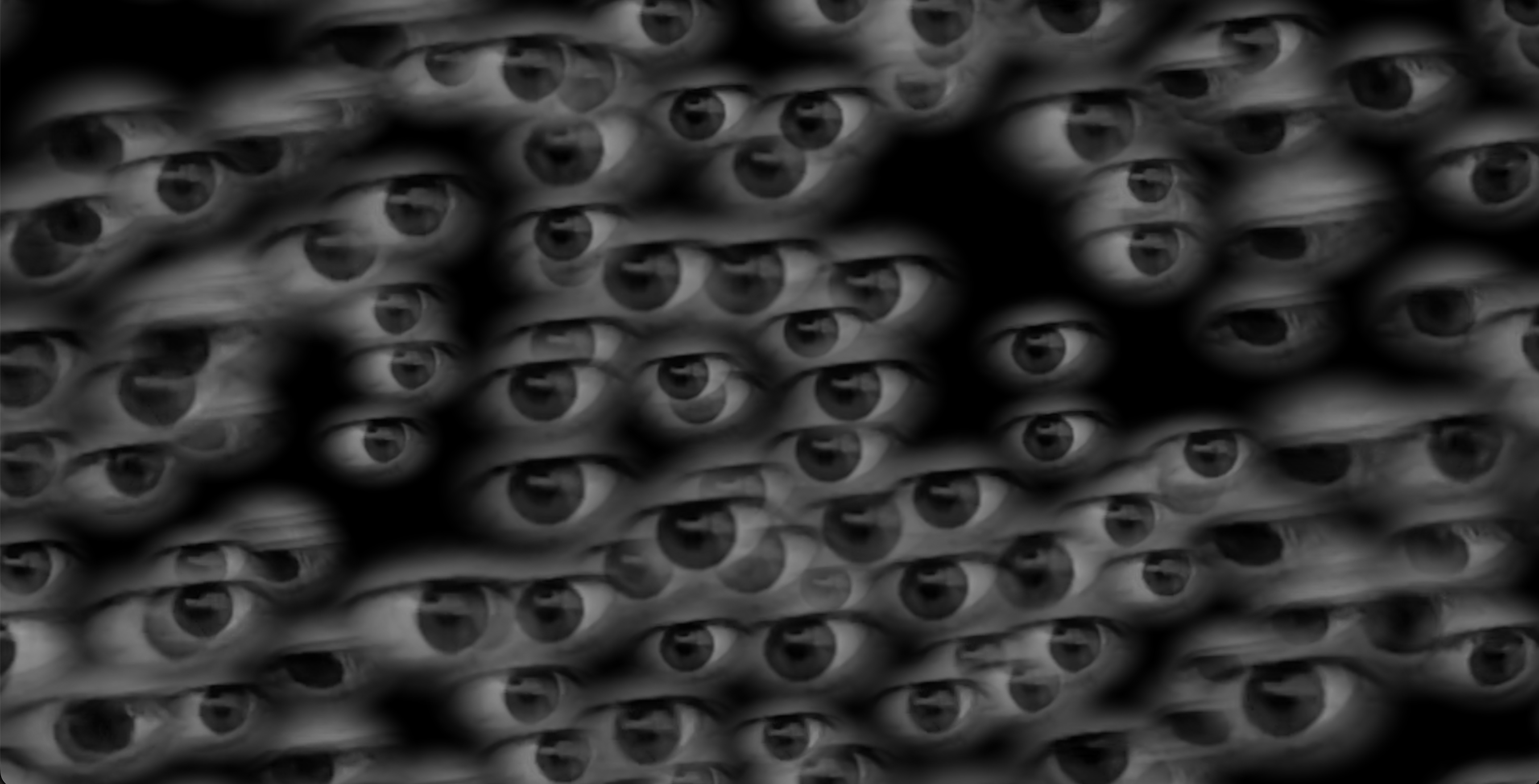
With feedback from peers and further ideation, the structured circles were removed and now the eyes appear in random spots on the screen and overlap each other. A delay was added over the blinking, to increase the surreal feel of this installation.
Visual direction
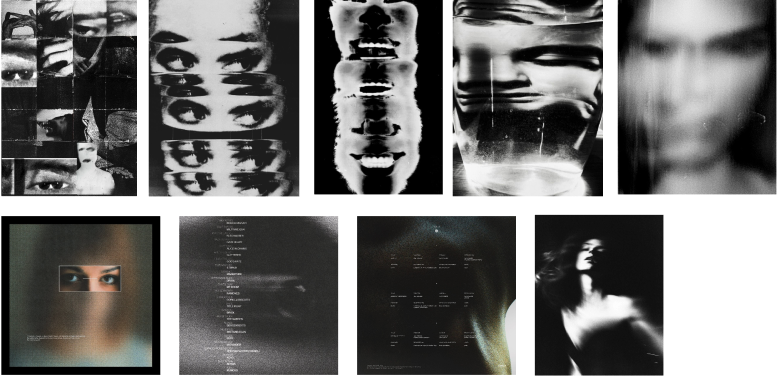
As team lead, I also assisted the graphic designer on shaping the visual direction especially the photographic elements and further visual iterations.
Eye following installation
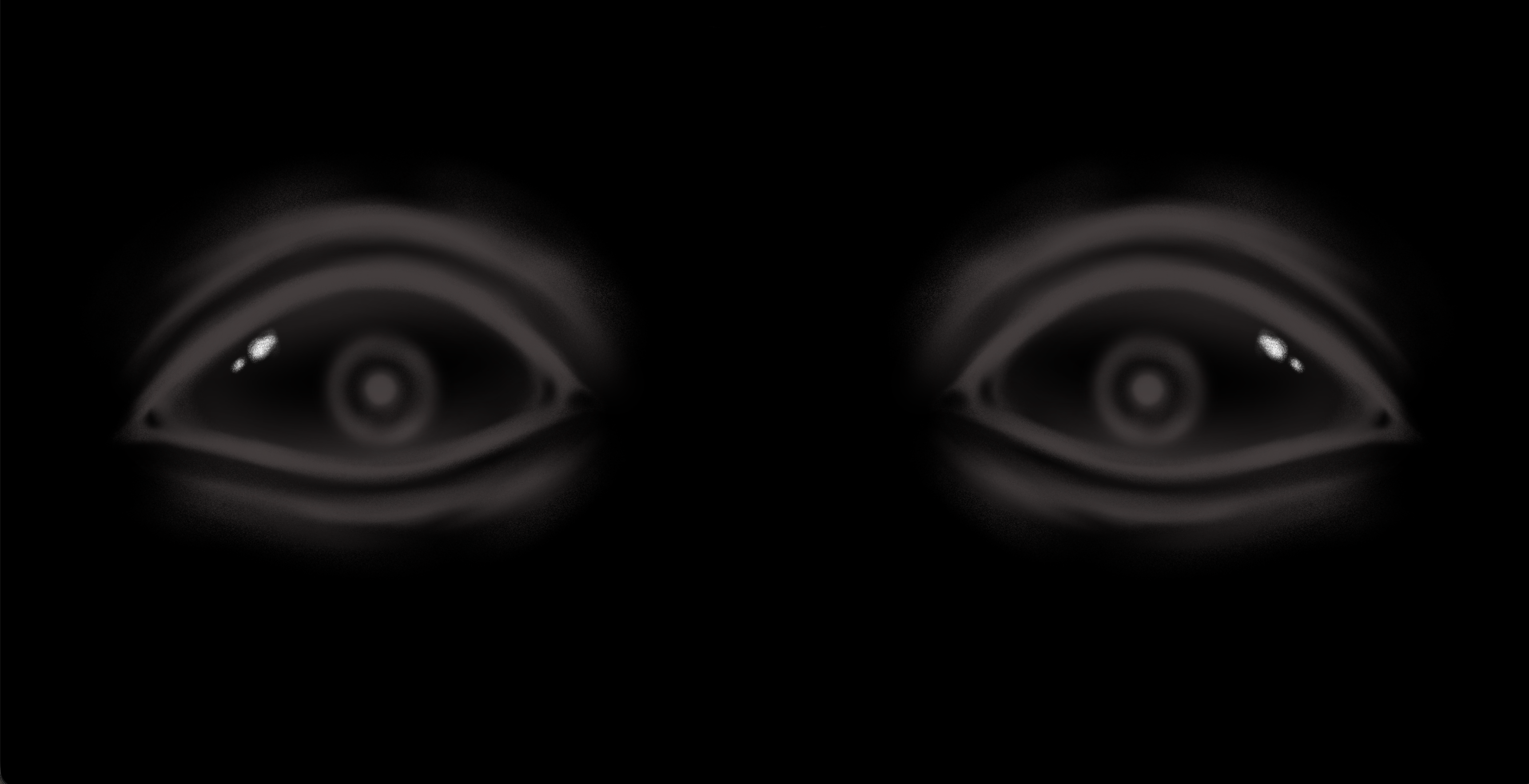
The eye following installation was created in collaboration with my teammate Sumaya.
She sketched the eyes and the eye socket and was brought to life using HTML, CSS and JavaScript on the browser.
Final version
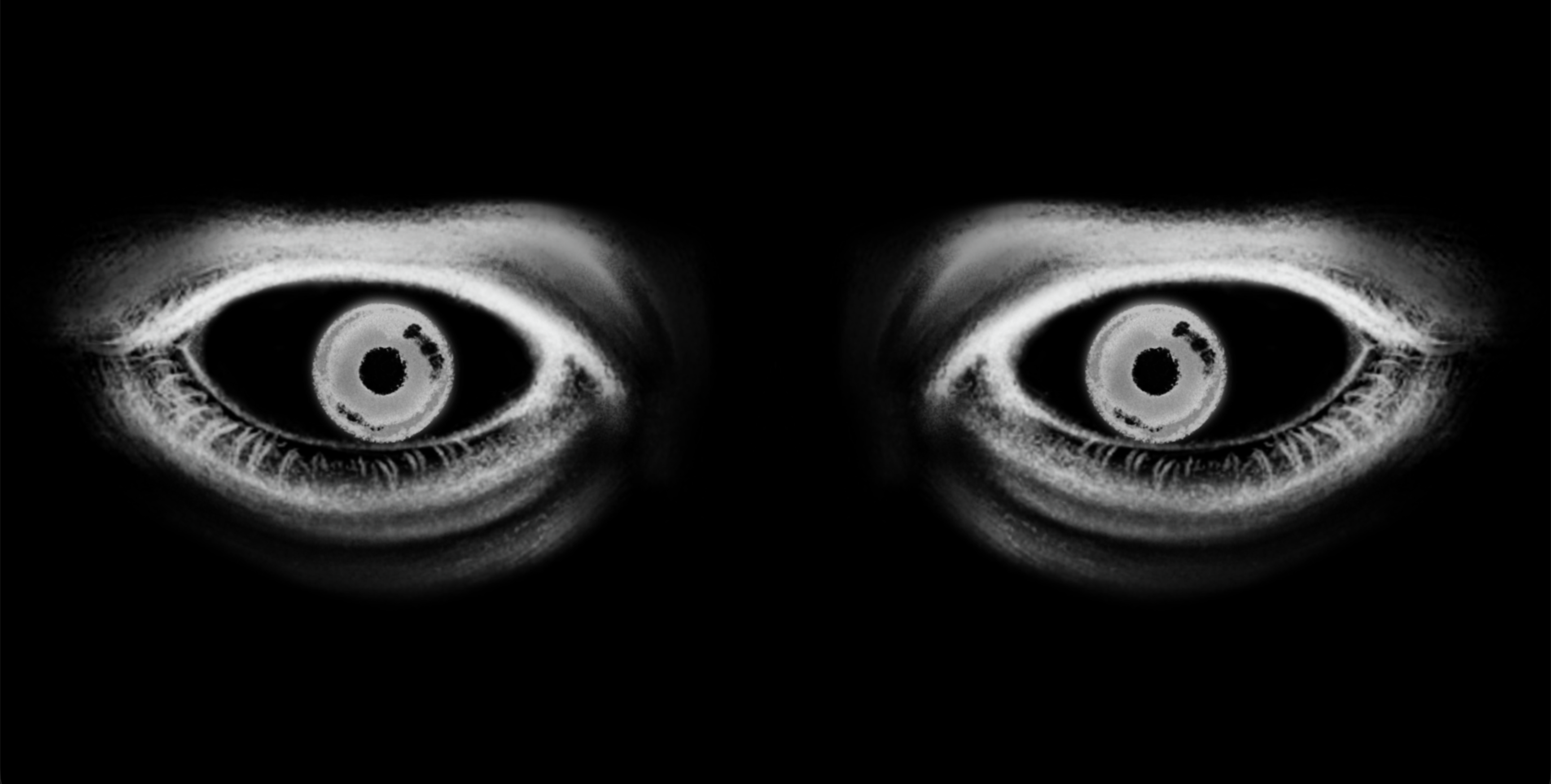
The final sketch of the installation was created to better suit the developed visual direction in the production phase.
My role in this installation was bringing it to life with code and testing the feasibility.
Website wireframes
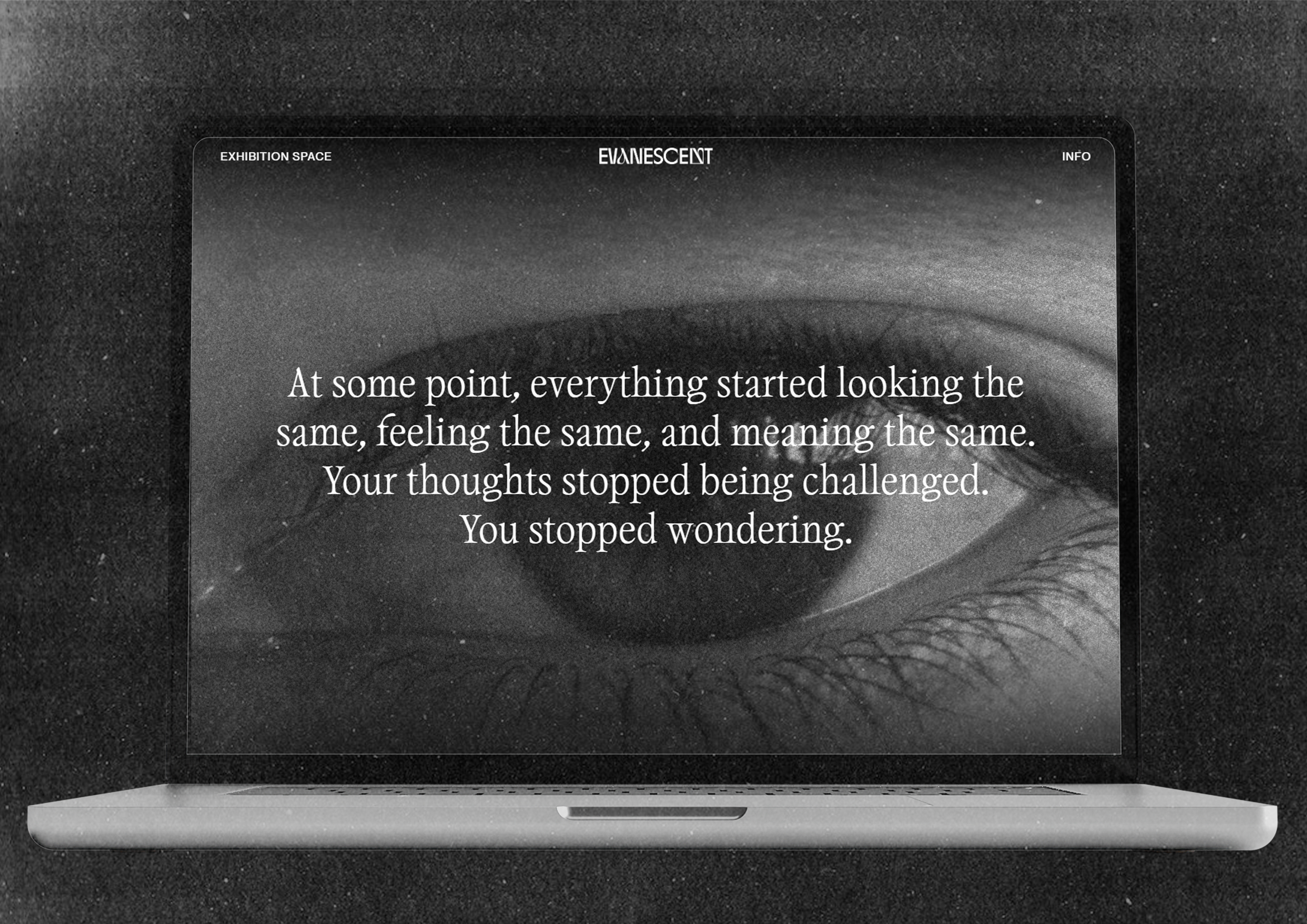
We wanted to create a website that still felt surreal and cohesive to the exhibition and finally would guide visitors to resources for burnout and encouraging people to explore their creative hobbies and to see with a change of perspective.
Final website
We worked on a website to raise awareness about how repetitive and mundane life can become sometimes.
The website shows surreal imagery matching the exhibition and drawing people into check out resources and organisations that can help with life's repetitiveness.
Outcome